Inspiration
The inspiration for this series is a lockdown time when we all were confined to our living space and communication was performed only through Zoom. We fantasized about being on a spaceship in outer space and having only these distorted images as a way of communication.
Process
- First, we Zoomed to brainstorm possible looks. We came up with 3 different looks with variations
- Then I collected all the materials through Blink (they delivered throughout pandemics) as they were not available directly in Ukraine. I also create a collar and then send everything to Vira. As with Spaceship, it took 2 months for the supplies to arrive at her hometown in Ukraine.
- Then we did a photoshoot. The quality of the pictures was even more awful than I suspected due to the bad Wi-Fi reception on Vira’s end. She didn’t have a camera to do a proper shoot as we did for example with Polina.
- Next, I tried to use Photoshop's new enhancer to improve images, but it didn’t work.
- Next, I tried to redraw the images digitally, which partially worked, but was far from ideal.
- Next, I started with the noise.
p5.js
Is a javascript library for creative people. A free course on it is here:
Chapter 1: Basic Noise
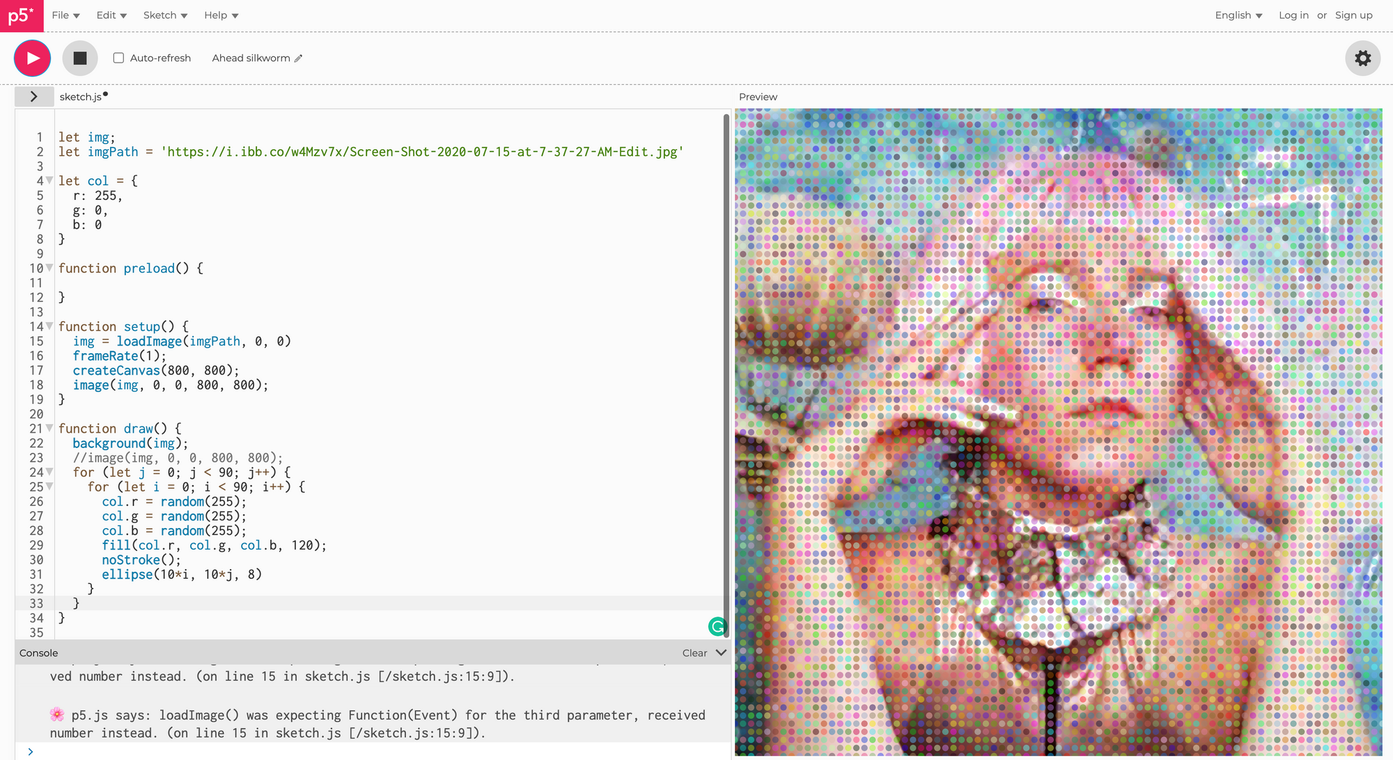
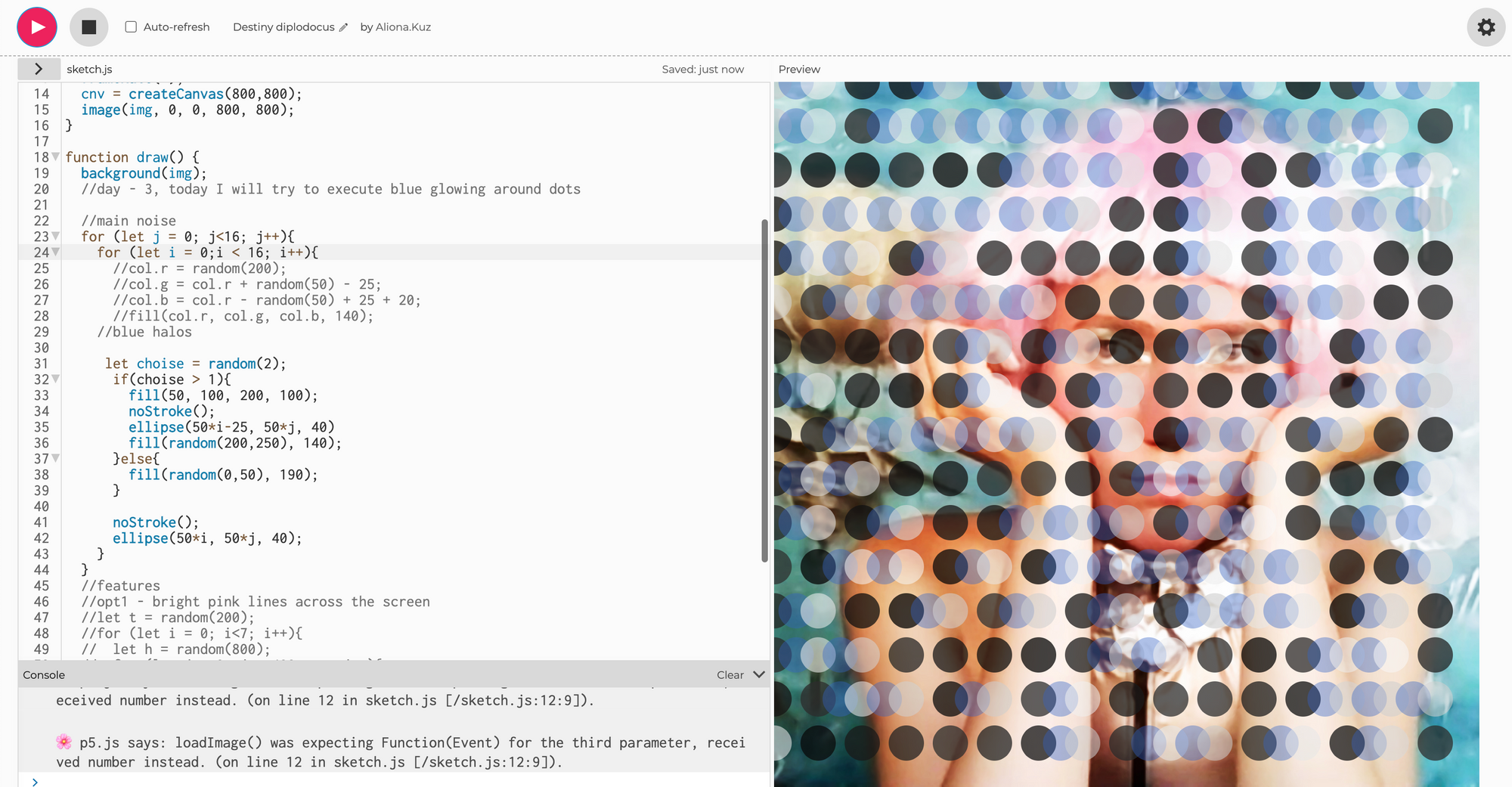
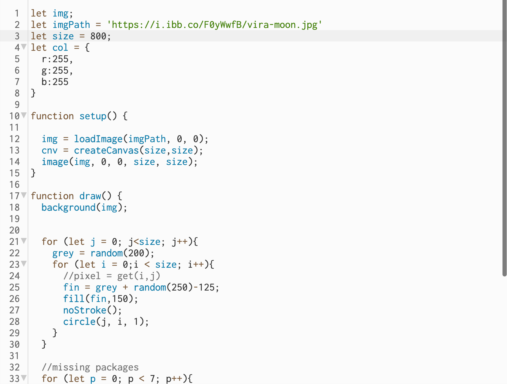
I started by just creating random colored circles on a grid:
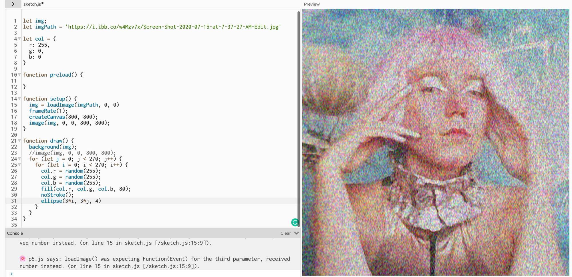
Then making circles small to create digital noise:
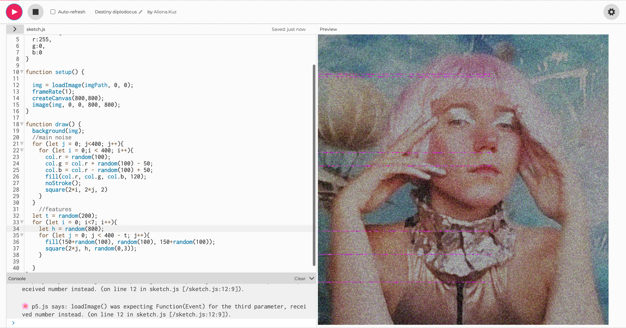
This noise is too colorful, so let’s make it more dim as well as add some random artifacts:
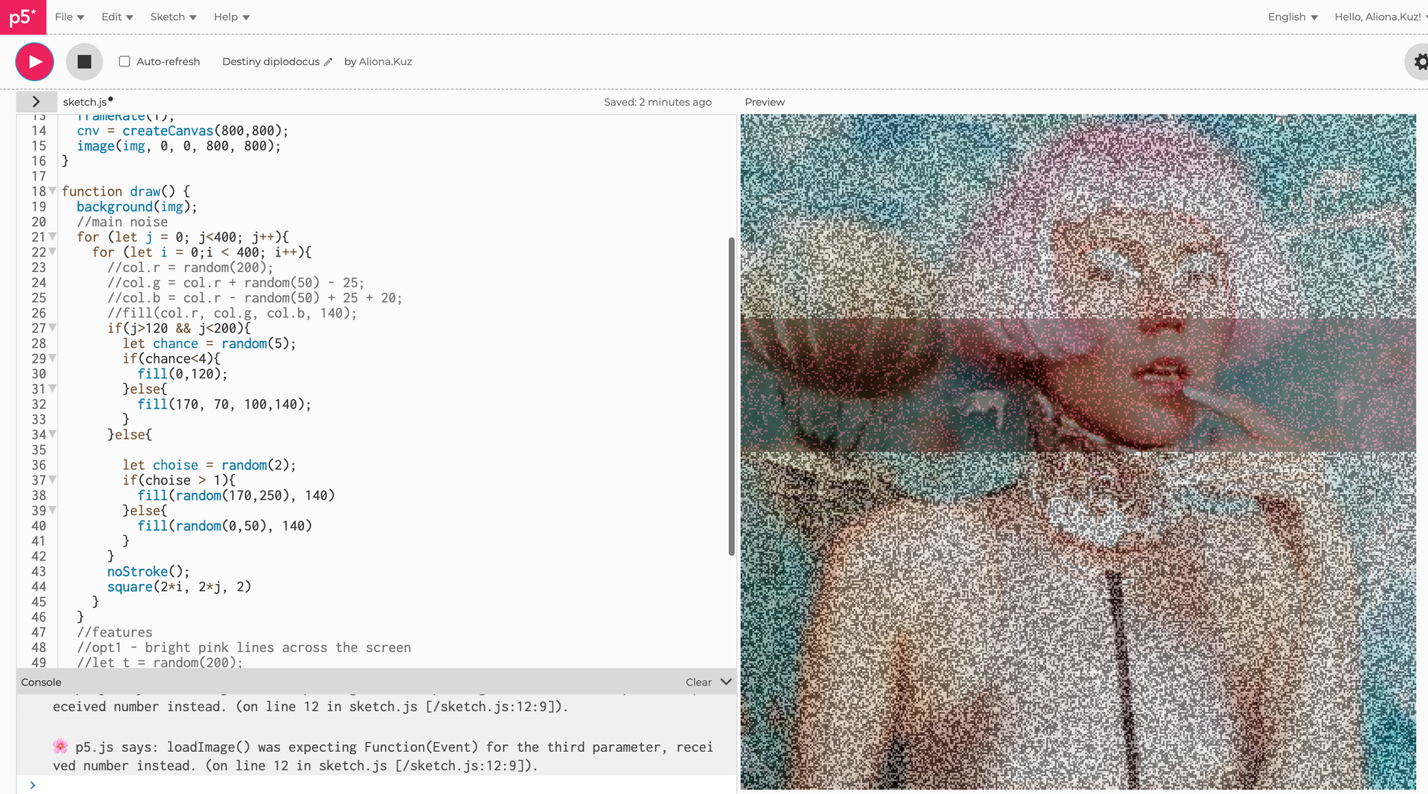
Or completely b/w noise and another style of artifacts:
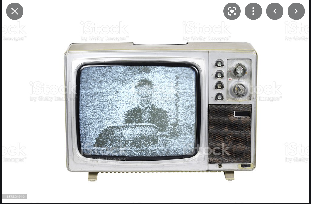
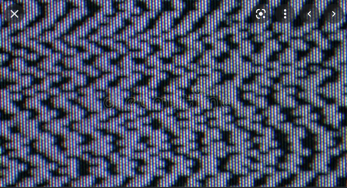
Chapter 2: Retro TV noise (failed)
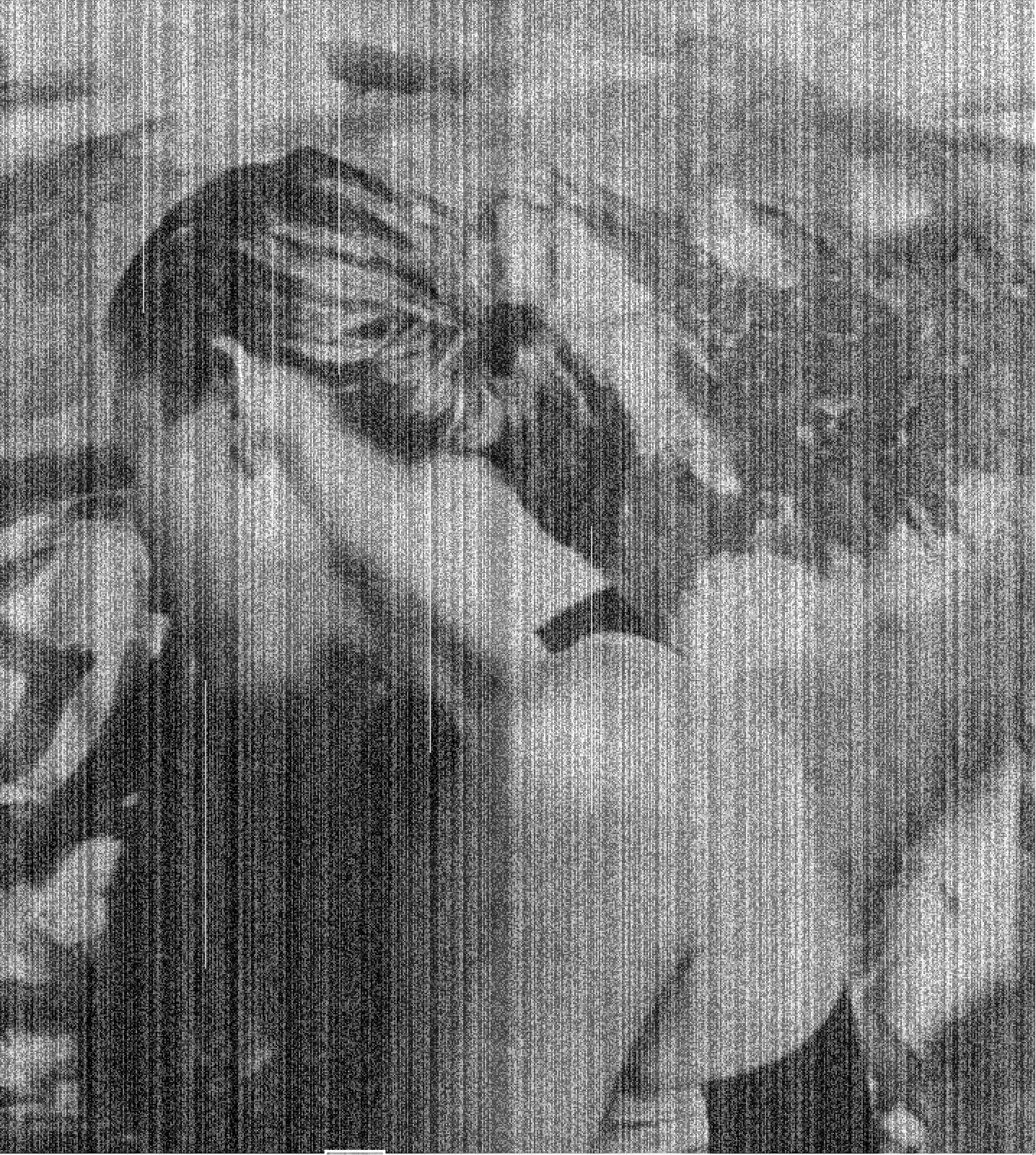
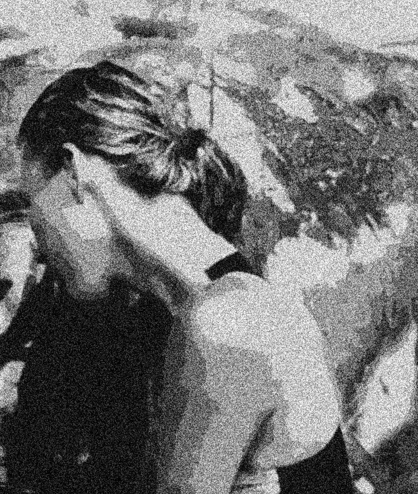
So, the first part took all in all 2 days, now I wanted to make noise more "analog", perhaps like the old TV noise
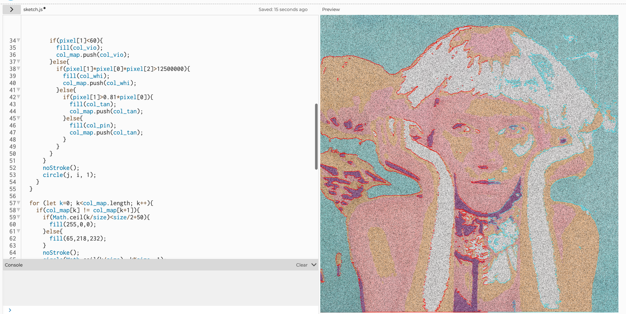
So I started to work with these white "flyes" when I discovered some of the limitations p5.js library. Namely, everything connected to Bloor was working super slowly with these objects.
So I was playing with all that and this was the moment when the war started. After I came back from Eastern Europe, I started to think about why do I need to do the analog noise at all, what is my story?
Chapter 3: More Research
I started to read about how the information is transmitted for deep space traveling.
Very soon I learned that the info is transmitted with radio waves. There is in fact a lot of noise, but the use of complex algorithms and data overlaps allows us to reconstruct the picture with impressive quality (look for example at this panorama of Mars): https://mars.nasa.gov/msl/multimedia/panoramas/?page=0&per_page=25&order=pub_date+desc&search=&category=304%2C305%3A176&url_suffix=%3Fsite%3Dmsl
Ok, but that's expansive! If every one of us would have our small spaceship, we would probably only have either very cheap or very old equipment.
That made me look at Voyager: https://voyager.jpl.nasa.gov/mission/timeline/#event-voyager-2-encounters-neptune
As well as first lunar missions.
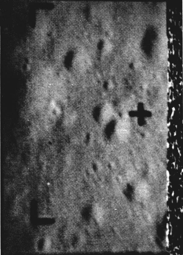
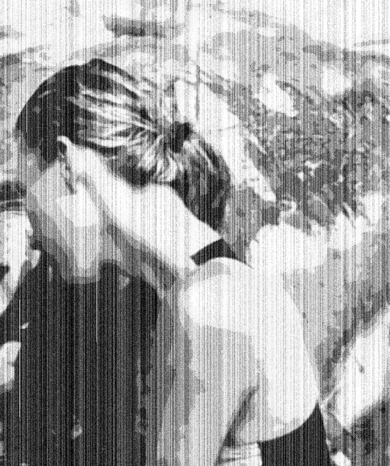
Chapter 4: Final Implementation
The moon inspired picture was done quite quickly. I noticed that there are little vertical lines with noise (maybe some packages missing when sending an image?) and I played off of it.
There was some annoying unexpected symbol in b/w that wasn't there in color, so I cropped it out because it was too contrasted and took too much attention.
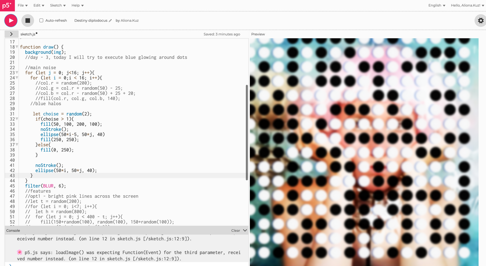
Then I also played with gradient maps to make a picture rougher
All of it with no more then 2 screens of code btw
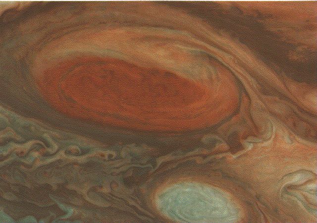
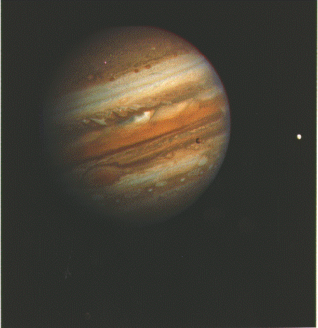
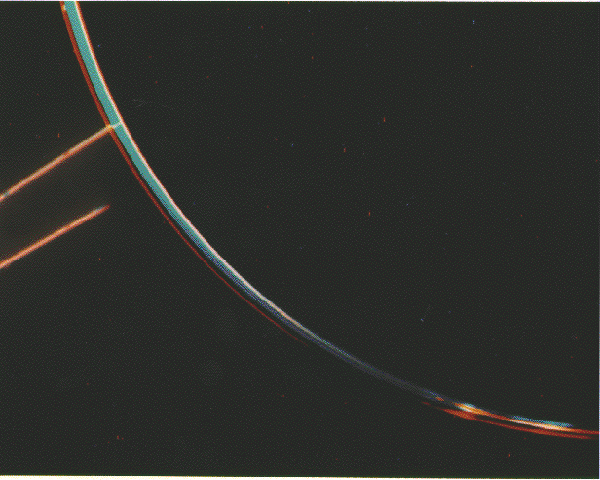
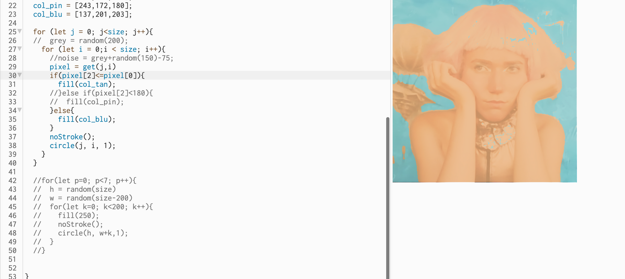
So then I went back in color and started to look at Jupiter's pictures. If you look very closely

you will see that the noise has a super fun structure. In fact, the pictures are glued together from 3 images shot through different colored filters. So there are just a few main colors and just a few noise colors.
So I went in the same direction and created a colormap for one of the images
It took some work to set the parameters right
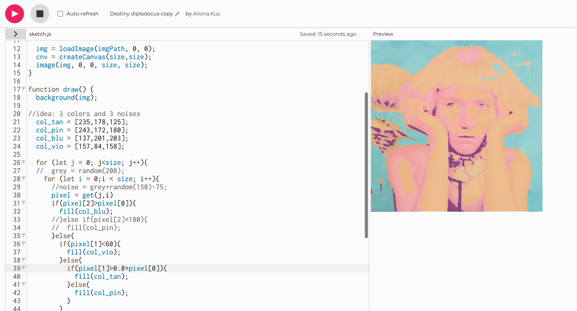
Then I created noise only in darker parts of the images.
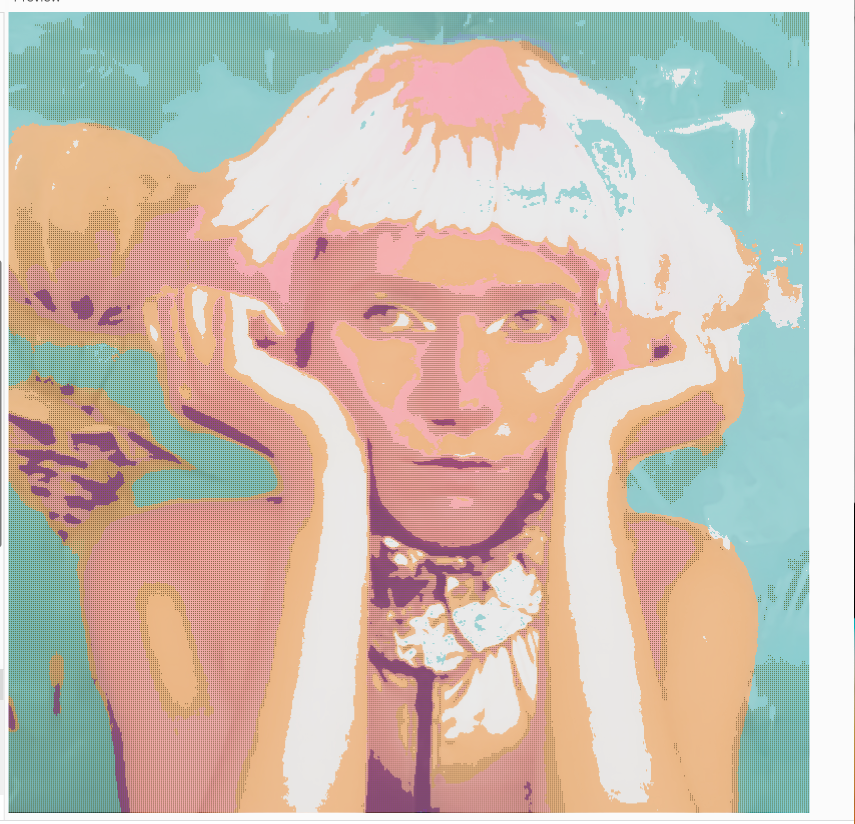
Also played with parameter. If you notice, the noise was a darker option of the same color at first, but later I made it actually complementary color to what it resided on, it looked much prettier and made more sense from the distance too
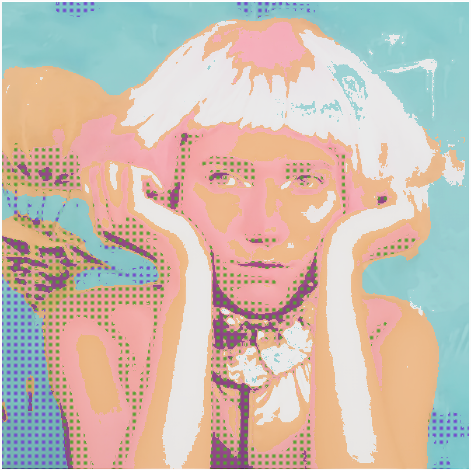
It was much less realistic than the Jupiter picture, but I would say it was interesting in its own right.
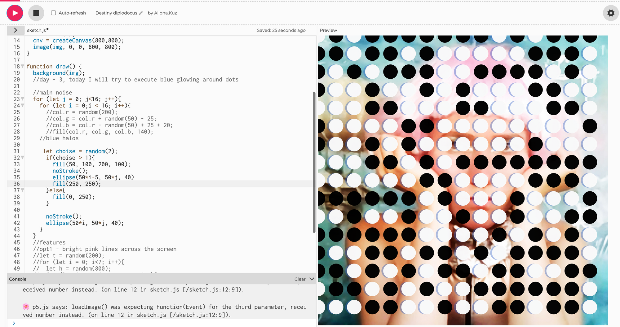
Then I also played a bit with a halo that you can see on one of the inspirations
It would be cooler to split red and blue further (esp on her hand and balloon) but I was kind of lazy by the time I got there. Notice, that I used b/w noise to desaturate the picture a bit, to make lines stand out.
And that was it. I liked the library - it's very intuitive and I plan another project with it in the near future.
Bonus one, with no argumentation.
Was this article entertaining?